primereact
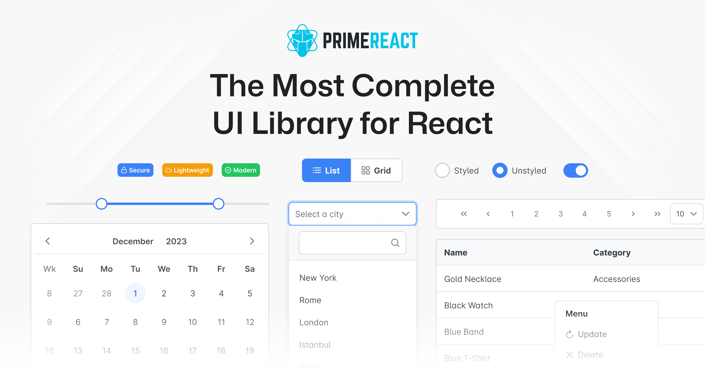
PrimeReact is a comprehensive UI component library for React, offering 90+ pre-built, themeable components ranging from form inputs and data tables to charts and overlays. It supports both styled (pre-skinned themes like Material and Bootstrap) and unstyled modes for full customization.
Embed badge
[](https://opensources.dev/resource/primereact)MITPermissive — free to use in commercial and proprietary software, with attribution.View license →
Production readiness
5/5- Actively maintainedCommits in the last 6 months
- No known vulnerabilitiesNo OSV advisories
- Clear, usable licenseMIT (permissive)
- Proven adoptionWidely used
- Has documentationDocumentation indexed
Our analysis
PrimeReact is an open-source React UI component suite from PrimeFaces, providing a large catalog of ready-to-use components with multiple theming options and tree-shakeable per-component imports.
When to use primereact
Choose it when you need a broad, batteries-included component set—especially heavy data components like DataTable, TreeTable, and calendars—and want to ship quickly with prebuilt themes rather than building components from scratch. It suits enterprise dashboards and admin panels where breadth of widgets matters.
When not to
If you want a headless/utility-first approach with full styling control from the start (Tailwind + Radix/Headless UI), a minimal bundle footprint, or deep design-system customization, a lighter or unstyled-first library may fit better. Teams already standardized on MUI or Ant Design ecosystems gain little by switching.
Strengths
- Very large component catalog covering complex widgets (DataTable, charts, schedulers) out of the box
- Dual styled/unstyled theming supports both rapid prototyping and full customization
- Per-component imports enable tree-shaking to limit bundle size
- Mature, long-lived project backed by the commercial PrimeFaces company with paid templates and support
Trade-offs
- Default styled components carry an opinionated look that can be effort-intensive to fully override
- CSS-class-driven styling feels dated next to modern CSS-in-JS or Tailwind-native libraries
- Large API surface and theming layers add a learning curve
- Historically some accessibility and TypeScript typing gaps relative to MUI/Ant
Maturity
Well-established and actively maintained with frequent releases, a large component set, commercial backing, and a sizable user base; production-ready for enterprise React applications.


PrimeReact
PrimeReact is a rich set of open source UI Components for React. See PrimeReact homepage for live showcase and documentation.
Download
PrimeReact is available at npm.
# Using npm
npm install primereact

# Using yarn
yarn add primereact

# Using pnpm
pnpm add primereact
Import
Each component can be imported individually so that you only bundle what you use. Import path is available in the documentation of the corresponding component.
//import { ComponentName } from 'primereact/{componentname}';
import { Button } from 'primereact/button';

export default function MyComponent() {
  return (
    <Button label="PrimeReact" />
  )
}
Theming
PrimeReact has two theming modes; styled or unstyled.
Styled Mode
Styled mode is based on pre-skinned components with opinionated themes like Material, Bootstrap or PrimeOne themes. Theme is the required css file to be imported, visit the Themes section for the complete list of available themes to choose from.
// theme
import 'primereact/resources/themes/lara-light-cyan/theme.css';
Unstyled Mode
Unstyled mode is disabled by default for all components. Using the PrimeReact context, set unstyled as true to enable it globally. Visit the Unstyled mode documentation for more information and examples.